
Data Tables list ui ux case study
ui / ux Design
Year:
2024
Technology:
Figma and Zeplin
Categories:
ui ux design,Introduction:
Problem Statement,Design Process,Solution Conclusion
Research, Analysis & Planning, Design, Prototyping,Launch
Research, Analysis & Planning, Design, Prototyping,Launch
The aim of this project was to design a table interface that enables users to efficiently view, manage, and navigate extensive data sets. Our focus was on delivering a clear, interactive table experience that feels natural and intuitive, especially for users managing large amounts of data daily.
Key Design Goals
Improve data accessibility by highlighting important columns and using sticky headers.Streamline navigation to help users move through rows and pages of data without frustration.
Provide quick access to actions like editing, deleting, or filtering, directly from the table interface.
Enhance customization options so users can tailor the table view to their preferences.
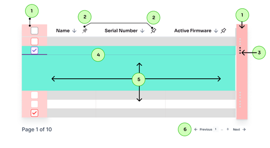
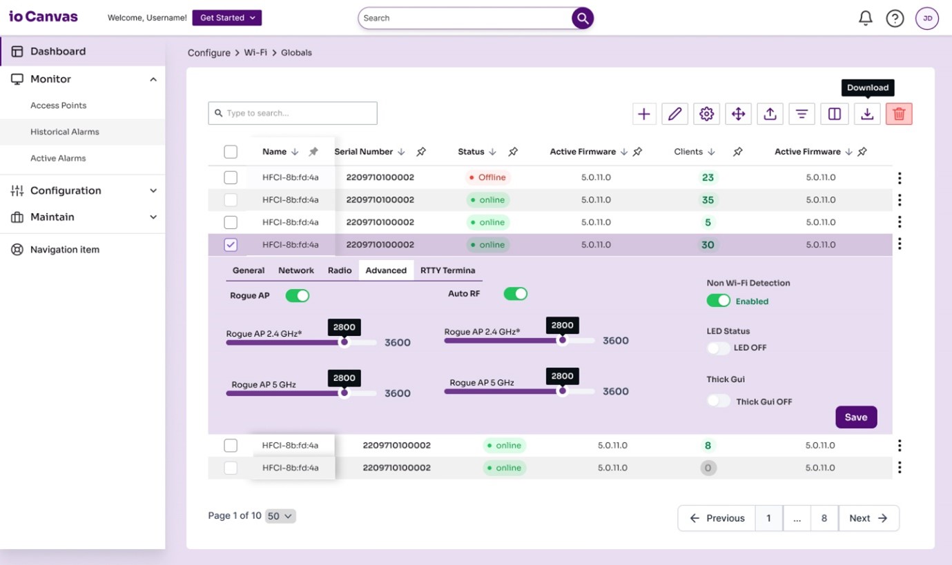
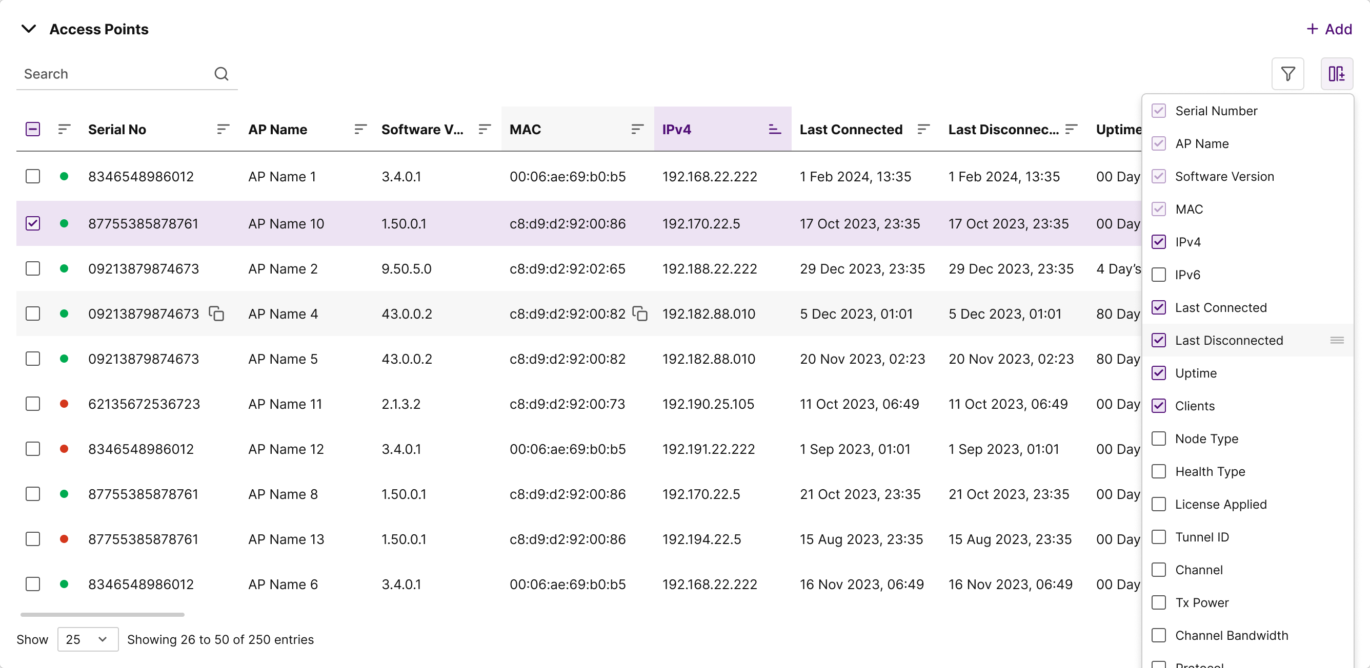
Sticky Headers and Columns
What We Implemented The header row and the first few columns were made sticky, so they remain visible as users scroll horizontally or vertically.
Why It Matters :In tables with many columns, users can lose track of which row or data type they’re viewing as they scroll. By keeping key columns and headers anchored, users can reference data context and perform comparisons more comfortably, without losing orientation in the table.
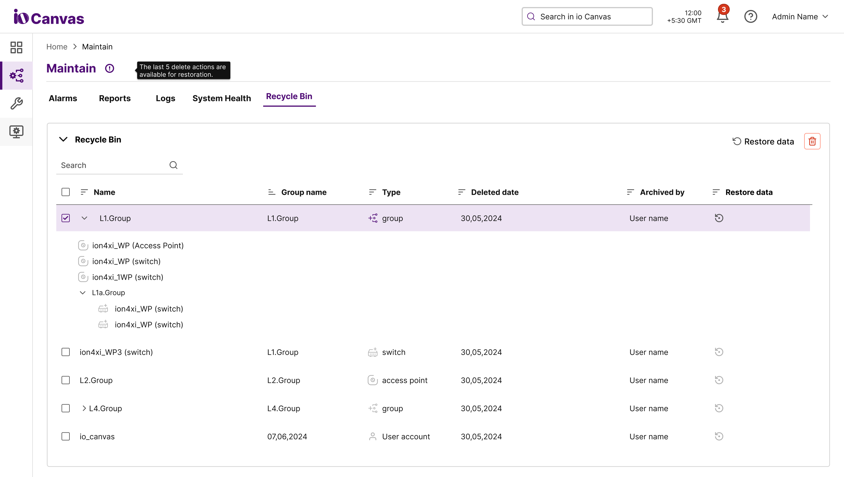
Expandable Rows with Inline Editing
What We Implemented :Each row in the table has an "expand" icon that reveals more details about the row when clicked. Users can also edit data inline within these expanded sections.
Why It Matters : This feature allows users to view and edit detailed information without leaving the main table view, reducing navigation time and making the editing experience more cohesive. Inline editing also helps users stay focused and in context, improving productivity and reducing friction.
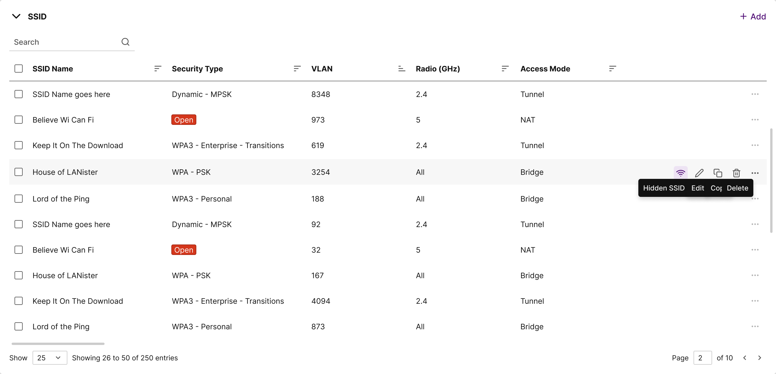
Column Customization and Bookmarking
What We Implemented : Users can customize which columns to display, hide, or bookmark as "sticky" columns that remain in view while scrolling.
Why It Matters :Every user has unique priorities for the data they need, so column customization allows them to create a table view that best serves their needs. Bookmarking key columns lets them anchor the most relevant information, speeding up access and improving the data exploration experience.
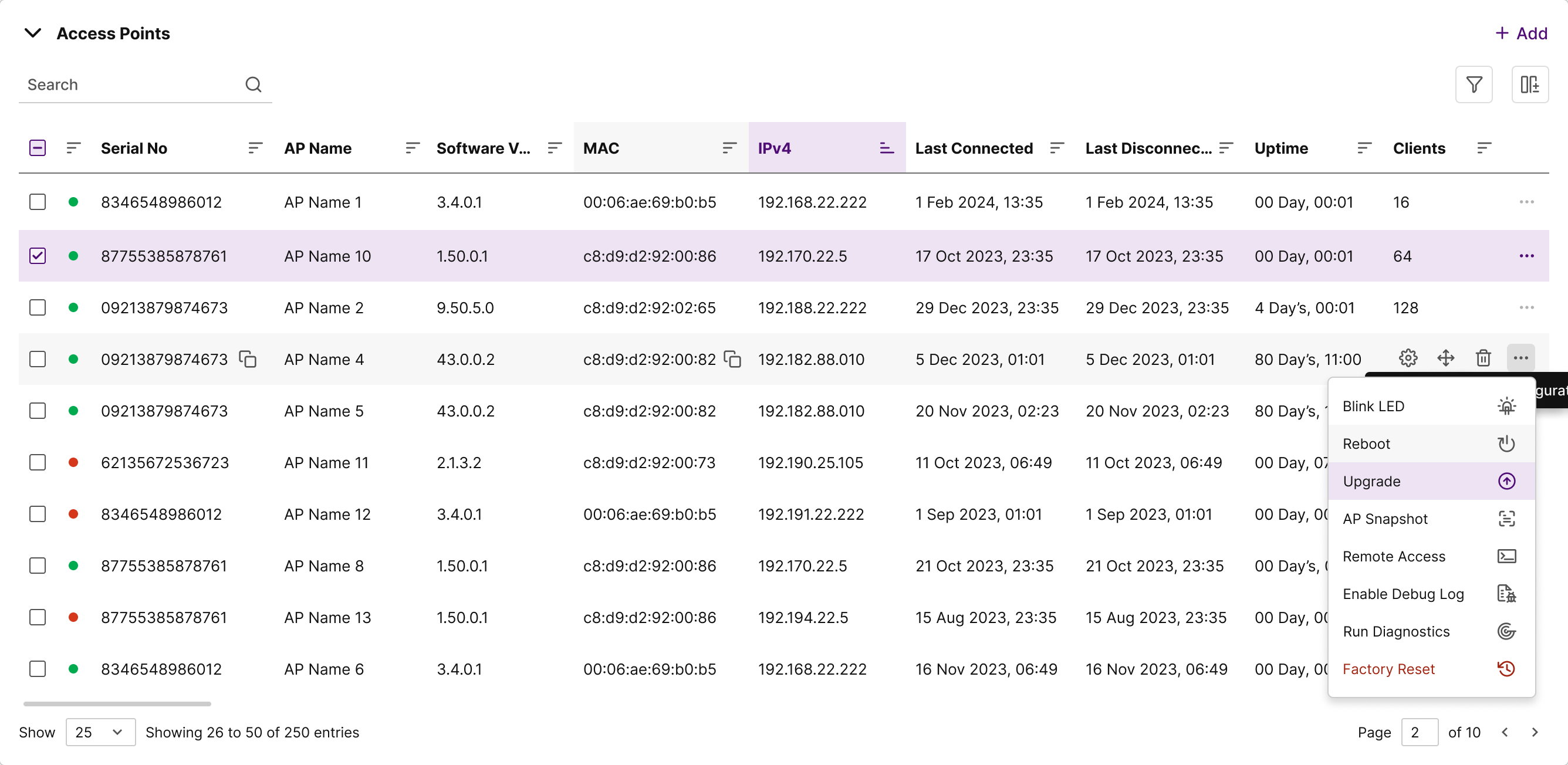
Multi-Level Sorting and Filtering
What We Implemented : We introduced multi-level sorting and filtering, allowing users to sort by multiple columns or apply filters that refine the displayed data.
Why It Matters : Large datasets often require more than one sorting criterion (e.g., sort by “date” and “priority”), so multi-level sorting lets users organize data in ways that make sense to them. The advanced filtering options also enable quick data discovery, which is invaluable for users who need to locate specific details in an extensive table.
Quick-Access Dropdowns for Actions
What We Implemented : A More icon on each row opens a dropdown with options for actions like “Edit,” “Delete,” or “View Details.”
Why It Matters : Tables often contain actionable items, so making options available directly from the row dropdown saves time and prevents users from needing to navigate away. It’s a compact, intuitive way to provide essential functions within the table without overwhelming the view with buttons.
Search and Pagination Controls
What We Implemented : A search bar was added to help users find specific rows quickly. Additionally, we implemented pagination with options to jump to specific pages, adjust items per page, and view total item counts.
Why It Matters :When tables contain hundreds or thousands of rows, it’s easy to feel lost or overwhelmed. Search functionality makes finding specific entries fast and easy, while pagination with detailed controls allows users to navigate large data sets without endless scrolling, giving them a sense of control and organization.
Hover and Highlight for Improved Readability
What We Implemented : A subtle hover effect highlights each row as the cursor moves over it, and an alternate background color for every other row was used for readability.
Why It Matters :Highlighting rows on hover helps users keep track of where they are, making it easier to scan through data. Alternate row colors improve readability, especially in dense tables, by providing a clear visual distinction that minimizes eye strain.
Results and User Feedback
The redesigned table interface significantly improved user experience by making it easy to navigate, customize, and interact with data. Key outcomes included:
Results and User Feedback
Increased Efficiency Users reported a 30% faster task completion rate due to features like sticky columns, inline editing, and customizable views.
Reduced Errors Multi-level sorting and filtering made it easier for users to analyze data accurately, leading to fewer misreads or mistakes.
Higher Satisfaction The ability to customize the table and anchor important columns provided users with a more personalized experience, increasing their overall satisfaction with the interface.
Users responded positively to the layout’s flexibility and praised the intuitive design, noting how it reduced their learning curve and made routine tasks feel easier and quicker.