io Canvas ( cnms )Cloud Network Management System
Research, Analysis & Planning, Design, Prototyping,Launch
Project Overview
Unified Cloud Network Management System (io canvas) web Application app was struggling with low user adoption and high abandonment rates. Users found the interface confusing , Report and maintain and couldn't complete basic tasks efficiently.
The Challenge
Complex navigation, outdated UI, and poor user flow resulted in 65% task abandonment rate
The Solution
User-centered redesign focusing on simplified navigation and intuitive task flows
The Impact
40% increase in engagement, 70% reduction in support tickets, After once we complete design we get positive feedback
Research & Discovery
Understanding user pain points and business goals through comprehensive research and data analysis.
User Interviews
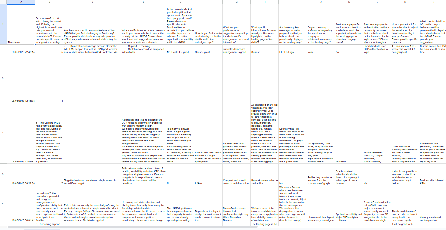
Conducted 20+ in-depth interviews with existing users to understand pain points and needs
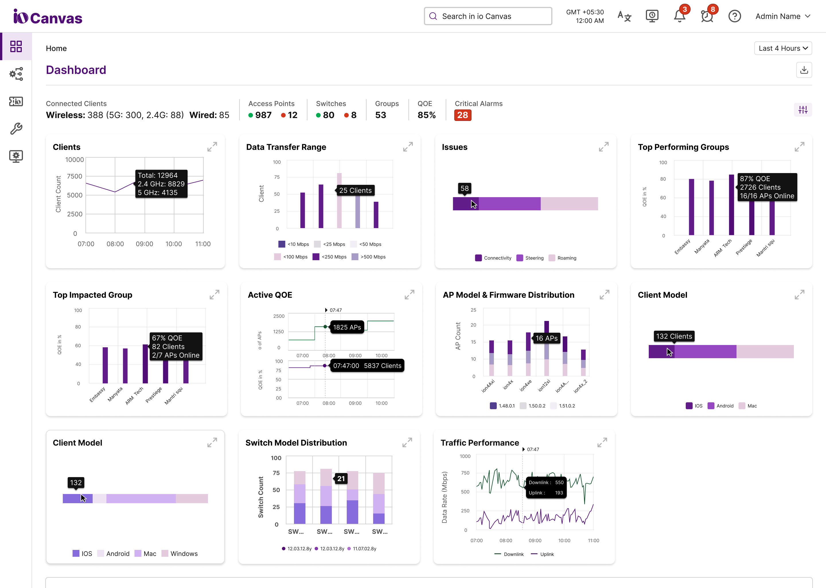
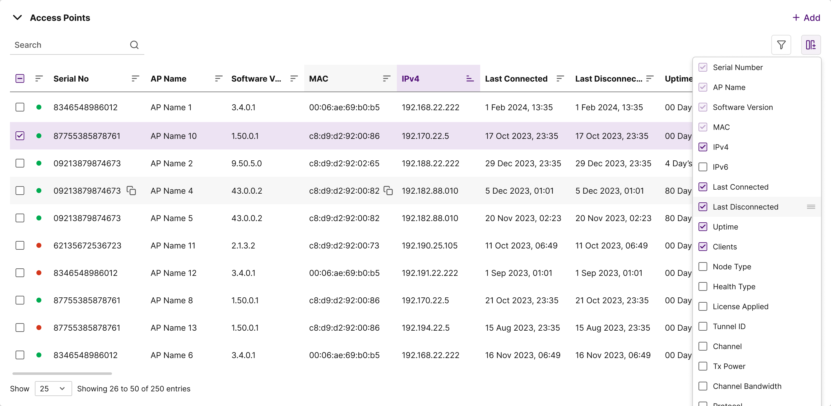
Web application dashboard Analytics
Analyzed user behavior data to identify drop-off points and usage patterns
conducted 12+ competitive
understand market trends and visual design strategies. This helped me avoid pitfalls, identify gaps, and create user-focused solutions that stand out.
Key Research Findings
😤 Pain Points
- • Complex navigation with too many menu levels
- • Unclear transaction categorization and history
- • Slow loading times and frequent crashes
- • Lack of personalization and insights
💡 Opportunities
- • Simplified dashboard with key actions upfront
- • Smart categorization and spending insights
- • Personalized financial recommendations
- • Quick actions for common tasks
Complete UI/UX Design Process
A comprehensive 8-step approach from research to implementation, ensuring every decision is user-centered and data-driven.
Research
Understanding user needs, behaviors, and pain points through comprehensive research methods. This foundational phase involved user interviews, surveys, and usability testing to gather insights.
-
Conducted 24 in-depth user interviews
-
Analyzed behavioral data from 1,000+ users
-
Performed competitive analysis of 12 web apps
-
Created user journey maps and pain point analysis
Define
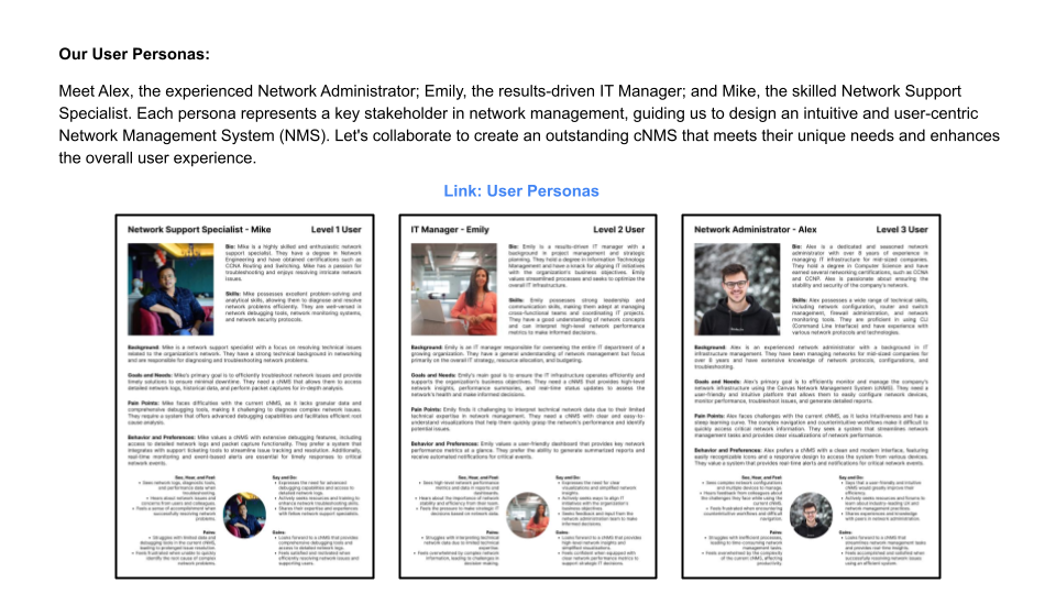
Synthesizing research findings to clearly define the problem the product aims to solve and the target user. This phase involved creating user personas, problem statements, and success criteria.
-
Created 3 detailed user personas based on research
-
Defined clear problem statements and hypotheses
-
Established measurable success criteria
-
Aligned stakeholders on project goals and scope
Ideate
Brainstorming potential solutions and design approaches through collaborative ideation sessions. Generated multiple concepts and evaluated them against user needs and business constraints.
-
Facilitated 6 design thinking workshops
-
Generated 100+ initial concept sketches
-
Used "How Might We" questions for solution exploration
-
Prioritized ideas using impact vs effort matrix
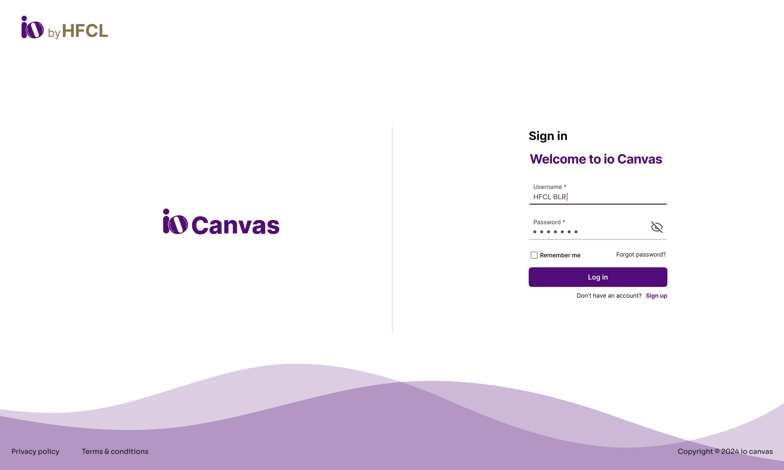
Prototype (Low-Fidelity)
Creating low-fidelity prototypes including sketches, wireframes, and basic user flows to test core concepts quickly. This phase focused on structure and functionality over visual design.
- Created 50+ hand-drawn sketches and concepts
- Built wireframes for 15 key screens
- Mapped out complete user task flows
- Tested paper prototypes with 12 users
.png)
Prototype (High-Fidelity)
Developing interactive, high-fidelity prototypes with realistic content, visual design, and micro-interactions. These prototypes closely resembled the final product for accurate testing.
-
Built interactive prototypes in Figma
-
Designed 500+ high-fidelity screens
-
Added micro-interactions and animations
-
Created comprehensive design system
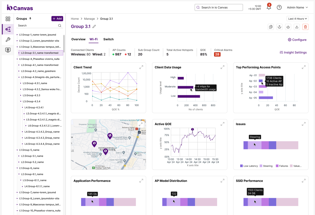
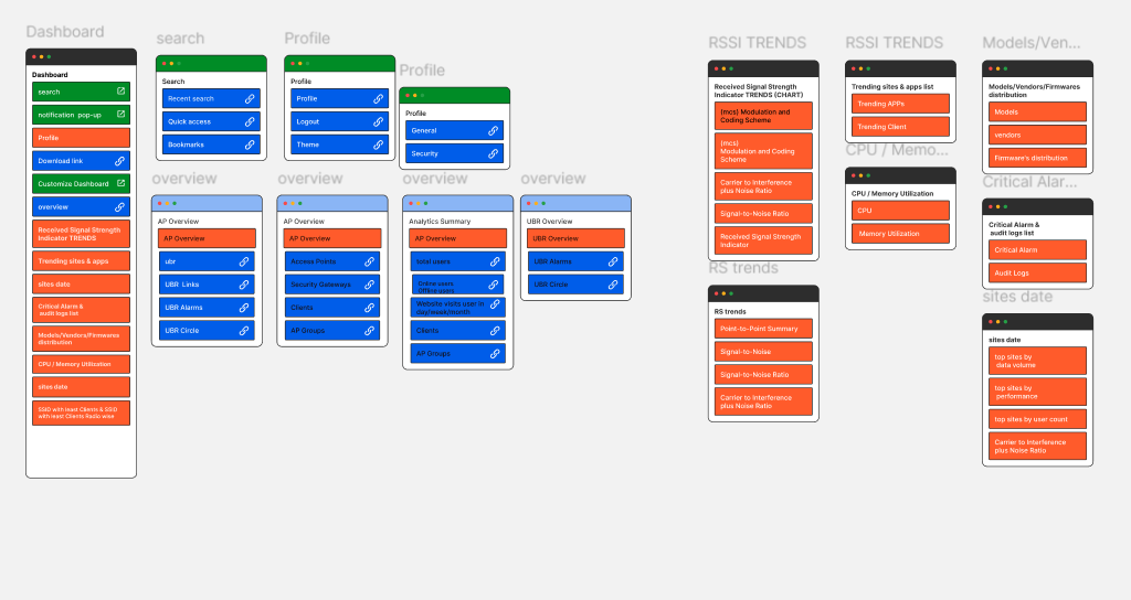
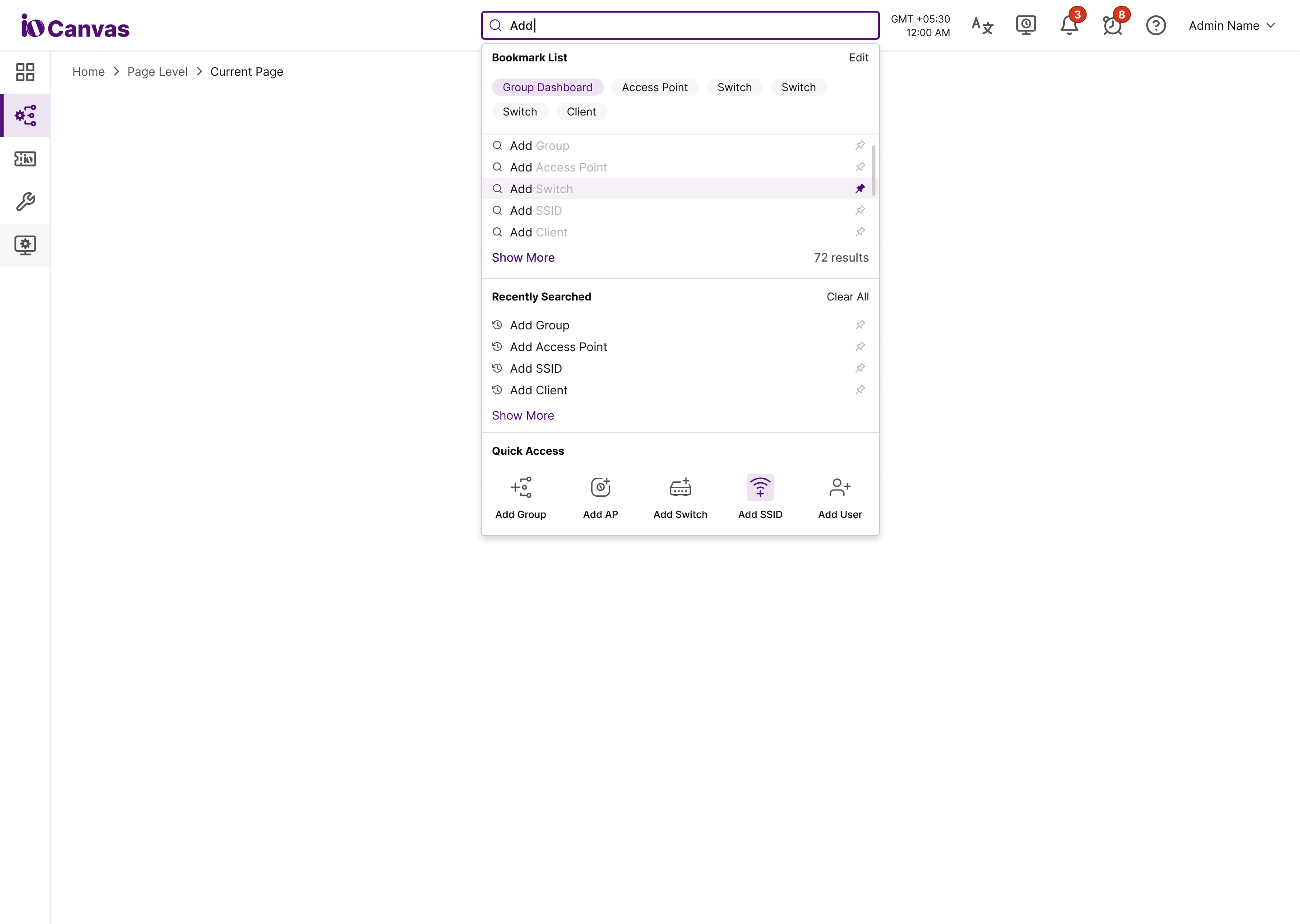
Information Architecture
Restructuring the app's navigation and content hierarchy based on user mental models and task frequency. Created a simplified structure that reduces cognitive load and improves findability.
-
Reduced main navigation from 8 to 4 primary sections
-
Prioritized most-used features on the home screen
-
Created logical groupings for related functions
-
Implemented card sorting and tree testing
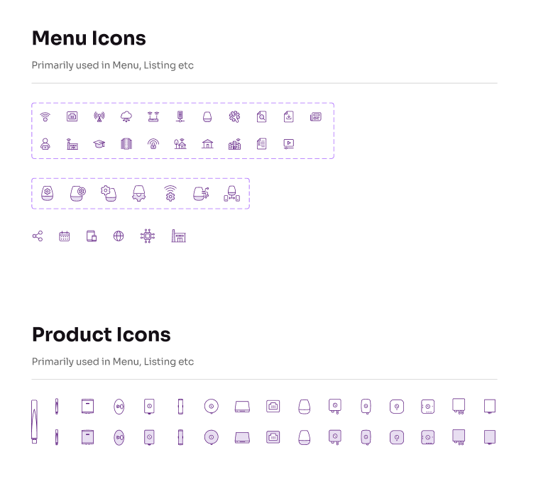
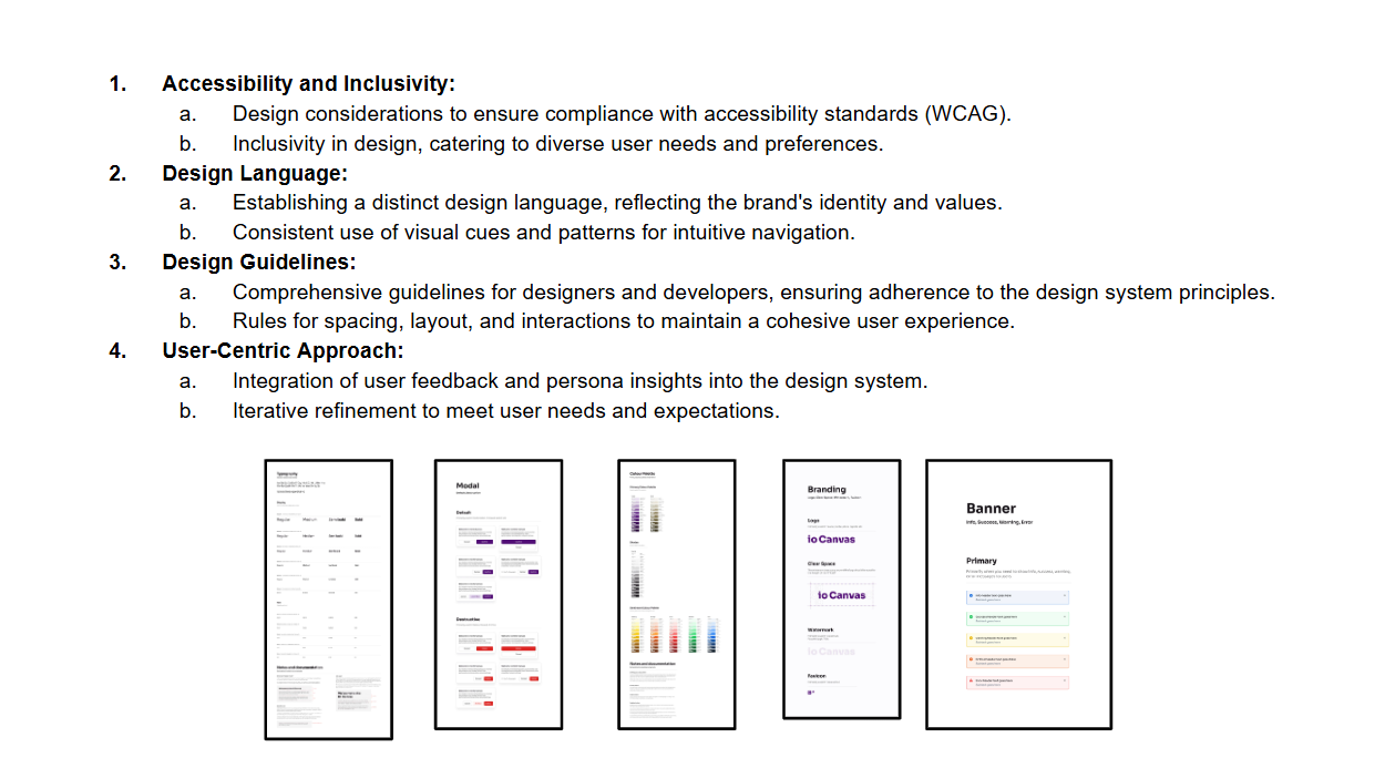
Visual Design & Design System
Developing a comprehensive design system with modern, accessible components and establishing a cohesive visual language that builds trust and confidence while ensuring consistency across all touchpoints.
- Established color palette optimized for accessibility
- Created 50+ reusable UI components
- Defined typography and spacing systems
- Documented design guidelines and usage rules
Results & Impact
The redesigned app exceeded all success metrics and significantly improved the user experience.
Engagement Increase
Daily active users and session duration improved significantly
Support Reduction
Fewer support tickets due to improved usability
Task Success Rate
Users can now complete tasks more efficiently
Key Learnings & Takeaways
🎯 What Worked Well
- • Extensive user research provided clear direction
- • Iterative testing and validation throughout the process
- • Strong collaboration between design and development teams
- • Focus on accessibility improved experience for all users
📚 Lessons Learned
- • Early stakeholder alignment is crucial for project success
- • Technical constraints should be considered from the start
- • User feedback is invaluable throughout the design process
- • Design systems accelerate development and ensure consistency