
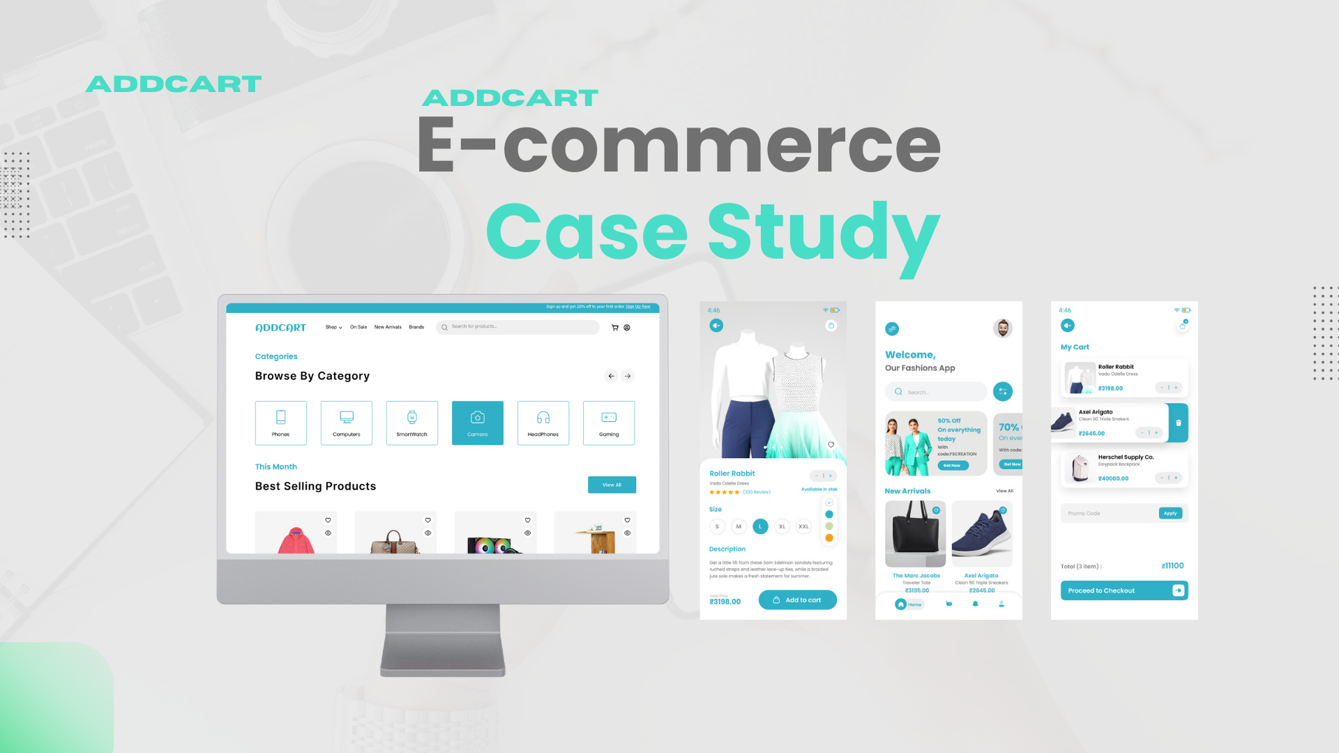
AddCart E-commerce Experience
ui / ux Design
Year:
2024
Technology:
Figma
Categories:
ui design,Introduction:
Problem Statement,Design Process,Solution Conclusion
Research, Analysis & Planning, Design, Prototyping,Launch
Research, Analysis & Planning, Design, Prototyping,Launch
To improve the user experience and visual design of an e-commerce platform for
desktop, mobile web, and a mobile app, focusing on increasing conversion rates, user
engagement, and retention.
Key Responsibilities:
Problem Statement
The existing AddCart platform faced the following challenges:
High cart abandonment rates on the desktop and mobile app.
Inconsistent design across web and mobile.
Limited engagement with new arrivals and top-selling sections.
Goal Redesign the platform to create a more intuitive and visually appealing shopping experience while ensuring accessibility and responsiveness.
Research Phase
User Research
Conducted interviews with 10 frequent e-commerce users to understand pain points.
Collected insights from user reviews and feedback on the app store.
Key Findings
Users wanted simplified navigation and better filter options.
Many users found the product pages too information-heavy.
Mobile users preferred quick access to the cart and checkout.
Competitor Analysis
Amazon
StrengthsSeamless product search with smart recommendations.
Detailed product pages with reviews, ratings, and Q&A.
One-click purchase for faster checkout.
Weaknesses
Overwhelming design for new users.
Too many promotions causing distractions.
Strengths
Zara
StrengthsMinimalist, visually appealing design focused on aesthetics.
Strong emphasis on seasonal collections and trends.
One-click purchase for faster checkout.
Weaknesses
Limited filter options, leading to a longer browsing time.
Less detailed product descriptions.
Strengths
H&M
StrengthsEasy navigation and well-organized categories.
Engaging loyalty program integration.
Weaknesses
Inconsistent mobile experience compared to the desktop site.
Basic cart functionality without personalization options.
Strengths
Design Process
Information Architecture
Created a user flow diagram to simplify the shopping process.
Reorganized navigation by introducing clear categories (e.g., “New Arrivals,”
“Casual,” “Top Selling”).
Wireframing
Designed low-fidelity wireframes for desktop, mobile web, and the mobile app.
Focused on the placement of filters, product cards, and CTAs.
Prototyping
Developed clickable prototypes in Figma to demonstrate flows for adding items to the
cart, applying filters, and navigating between sections.
Accessibility
Easy-to-read fonts and high-contrast buttons
UI Design
Design Language:
Colors Used AddCart’s signature blue for trust and white for a clean, modern look.
Typography Selected a modern sans-serif font for readability and consistency.
Icons Designed minimalist, intuitive icons for filters, navigation, and cart actions.
Key Screens Redesigned
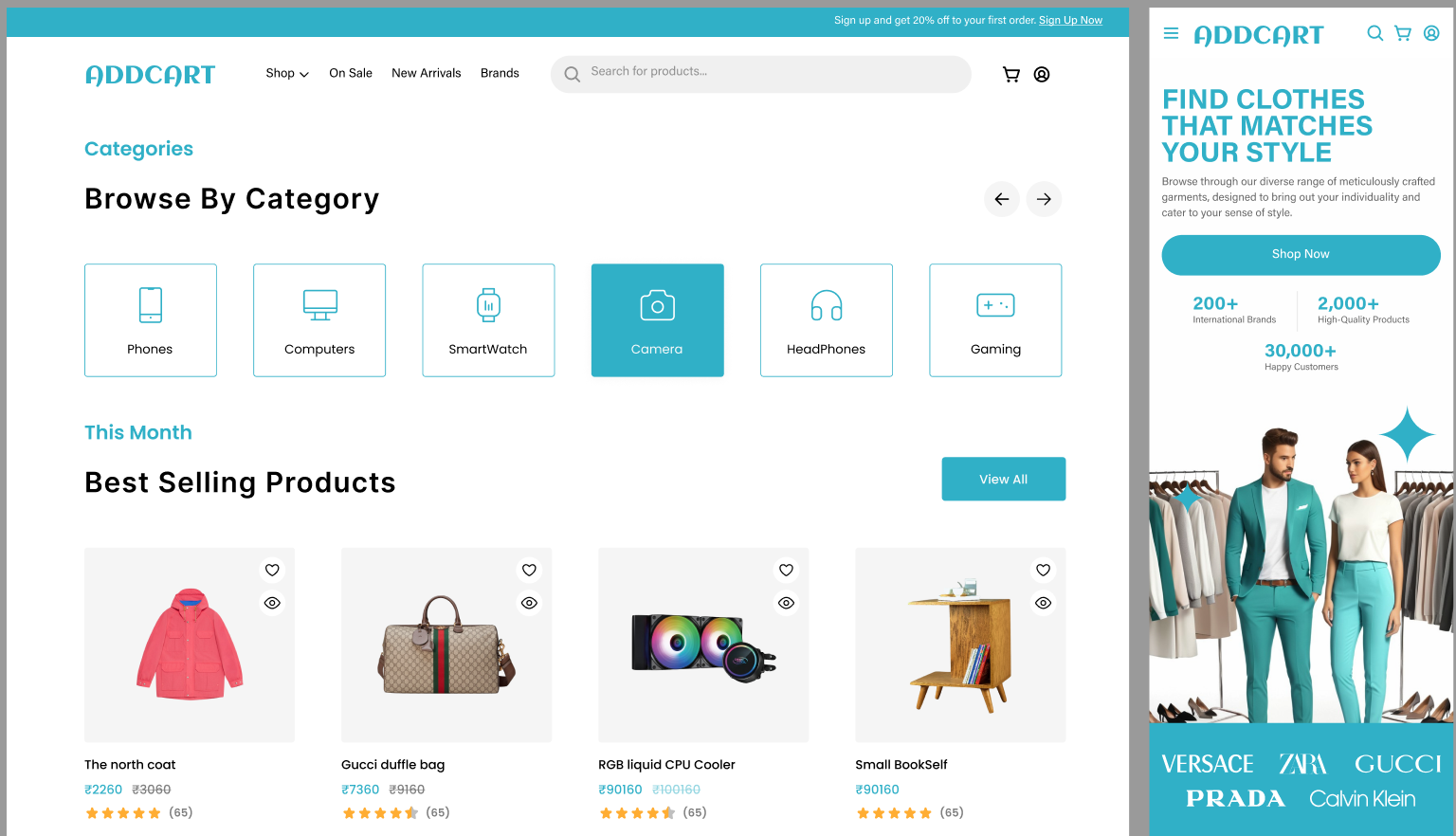
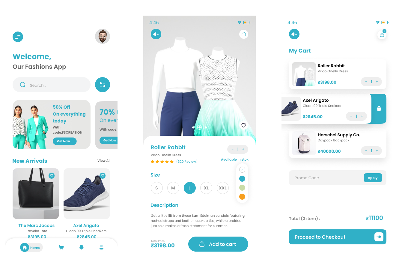
Homepage:Highlighted promotions (“50% off on everything today”).
Added a carousel for new arrivals and top-selling items.
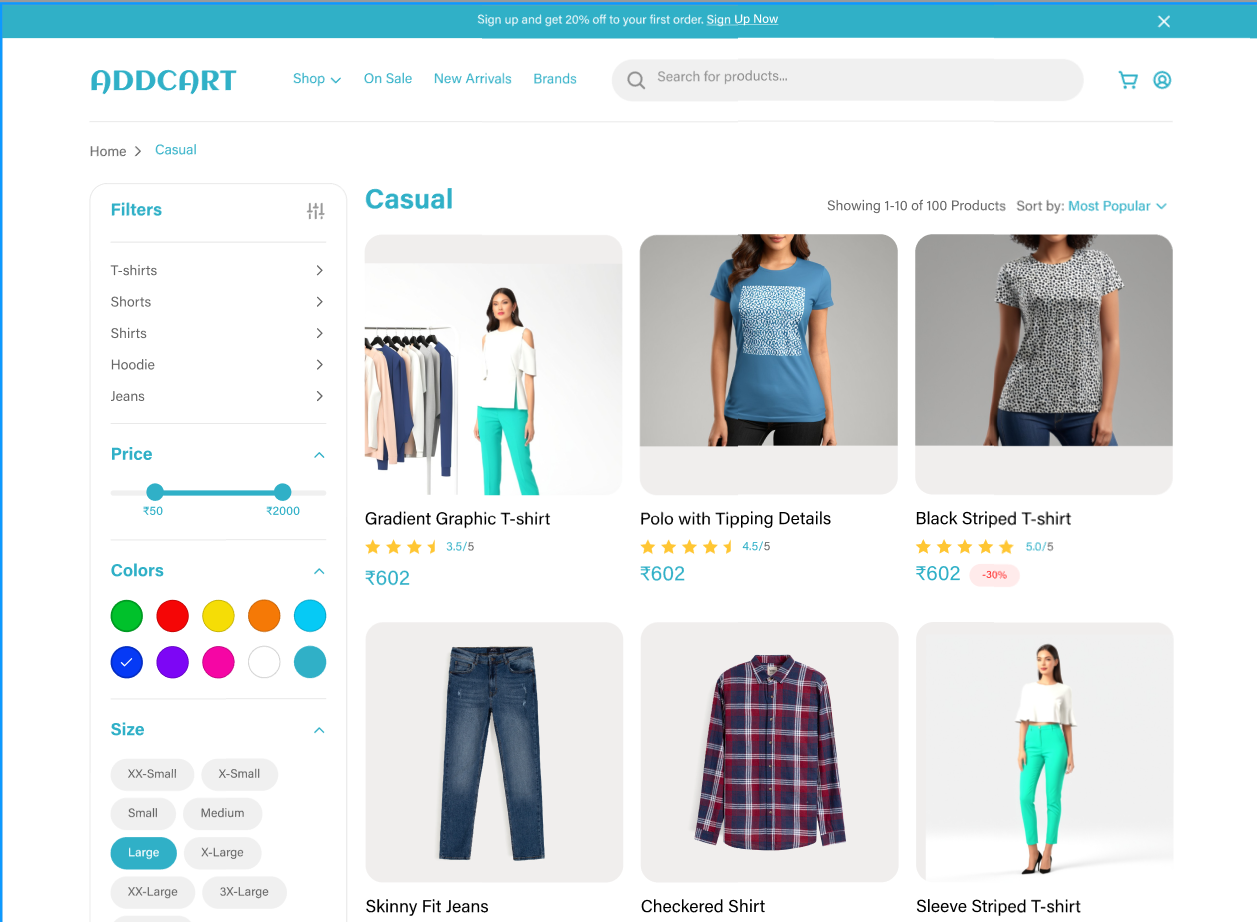
Category Page:
Improved filter options with interactive sliders and multi-select checkboxes.
Streamlined the grid layout for better product visibility.
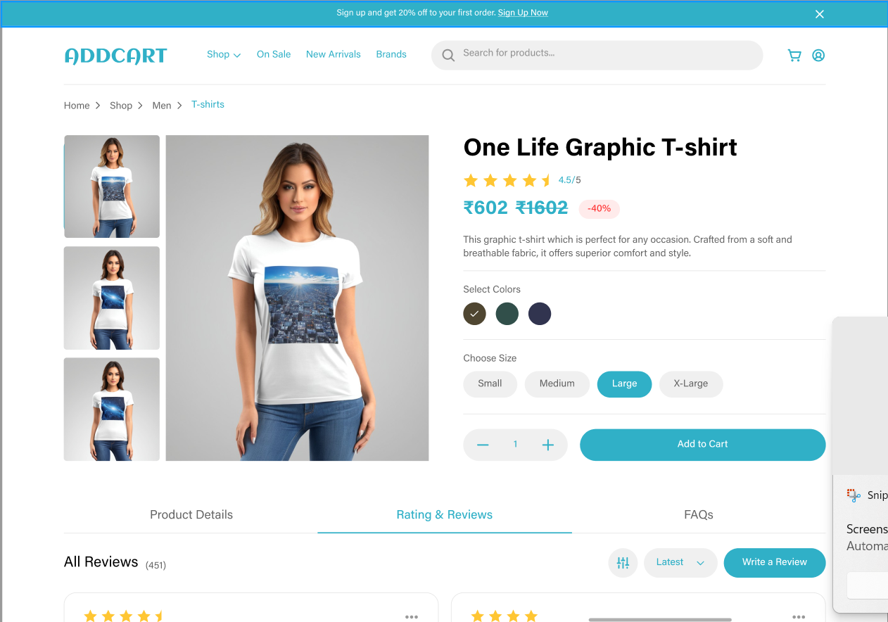
Product Details Page:
Simplified content with clear pricing, size selection, and reviews.
Added a sticky “Add to Cart” button for mobile users.
Cart Page:
Introduced a cleaner design with product thumbnails, quantity adjustment, and promo code sections.
Design System:
Created reusable components like buttons, cards, dropdowns, and icons to ensure consistency across platforms.
Homepage:
Usability Testing
Collaboration with Developers
Results:
Reflection
Challenges Balancing business requirements with user needs.
What I Learned The importance of iterative testing to validate design decisions.
Future Goals Implement AI-driven personalization features to further enhance user engagement.